Keeping it brief
If, like us, you’re passionate about the visual arts, have a budget, an idea and a unique international licence to produce exclusive merchandise from one of the world‘s most beloved set of books, then art direction will probably be one of your favourite jobs too. In this little piece I want to talk a bit about how and why some of our recent guest artists‘ stamps came into being.
Bill was a joy to work with and we‘re indebted to him for giving us his time and energy. Personally I think it‘s one of the nicest stamps we've produced in the traditional style.
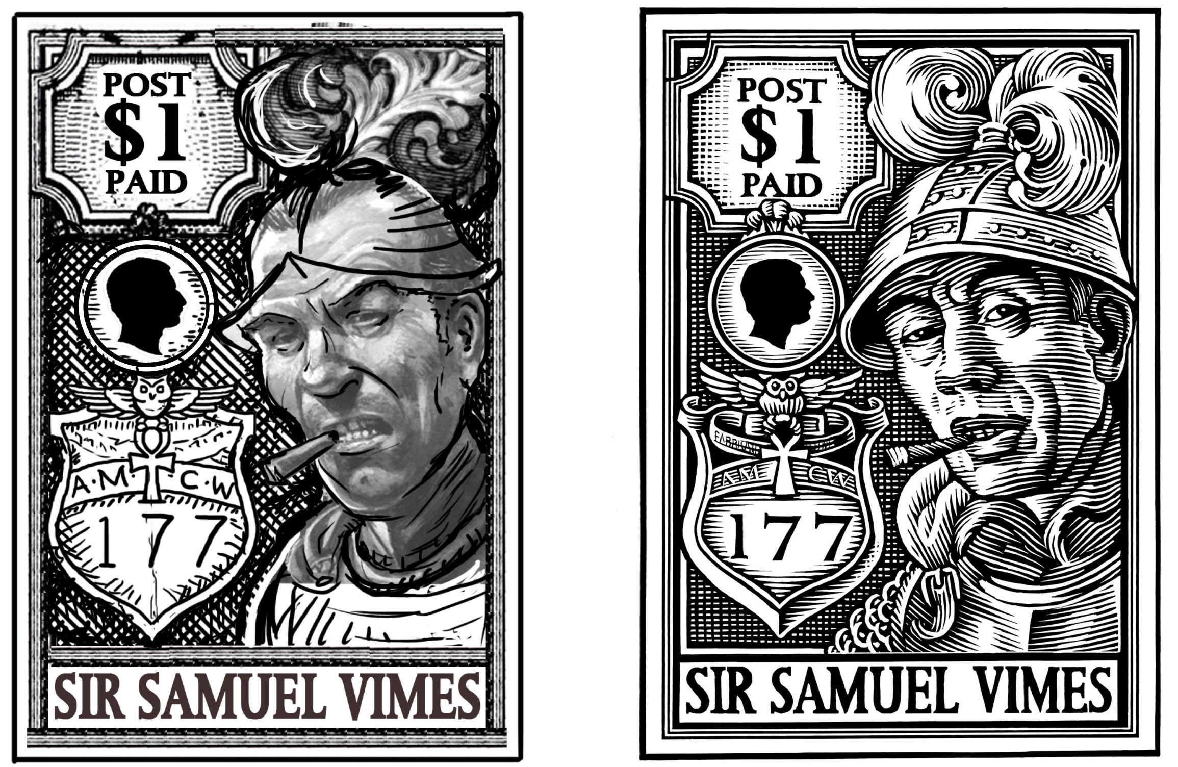
The first step is generally finding the right artist for the job. In many cases I’ll pursue an artist due to a pre-existing link to the Discworld. Partially because I know that our customers will have an awareness of the artist’s work and partially because that artist will have an awareness of what our customers will enjoy. Occasionally I spot an artist whose work is just so glorious that I have to find a job that will suit them. Either way, the second step is to analyse their work and design a job that will play to their strengths. Let’s take the wonderful Bill Sanderson for example. Pop his name into any popular search engine and you‘ll see a plethora of work. His ability to describe form with line is exceptional. To describe the shape of a face is no mean feat, but to give it such weight, mass and body using a very few lines; that is a rare skill indeed. Bill really is a master of his craft. I decided that if we were able to attract someone so advanced in portraiture that they ought to be given a worthy subject. Good old Sam Vimes is now His Grace, His Excellency, the Duke of Ankh, Commander Sir Samuel Vimes. He is known all over the Disc. It was entirely feasible that he would now be honoured by the city that he protects. So the two seemed like a good match. I briefed Bill with 3 pages of information on Sam, some historical and contextual reference material, some stamps and a couple of books to get him in the mood. It was one of the more straight forward jobs I have briefed, in that we already had a likeness of Vimes which Terry had approved (by another frequent collaborator, Peter Dennis). Here is the thumbnail sketch I sent to Bill, alongside his finished artwork and the issued stamp.
Joe, who is the cover artist of the Gollancz Discworld Collectors Edition Library and a Discworld Calendar artist), was equally fun to work with. He has been a Discworld fan for many years, indeed he was a member of the Clarecraft Collectors Guild many moons ago.
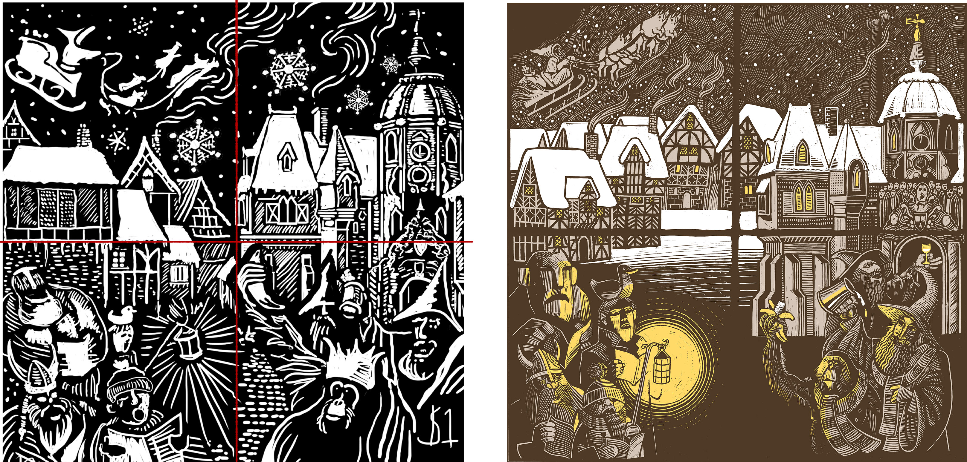
I chose to invite Joe to work with us for his ability to use pattern and shape to make an image. He has an unrivalled ability to understand positive and negative space. Look carefully at the way he describes the planes of the building on the left in the piece below, reversing the line-work to create light and shade. Look at the Senior Wrangler‘s hand holding his sherry glass. It’s almost entirely two dimensional in design but the angle and position of his pudgy fingers really shows how delicate and precious the glass is. It’s his clean, clever and playful treatment of the details that makes his work so exquisite. Again, working with such an accomplished artist meant that I could keep my brief fairly simple. There were a few phone calls, the obligatory ream of random notes from me describing what I was looking for and the scribble you see here and the issued stamps.
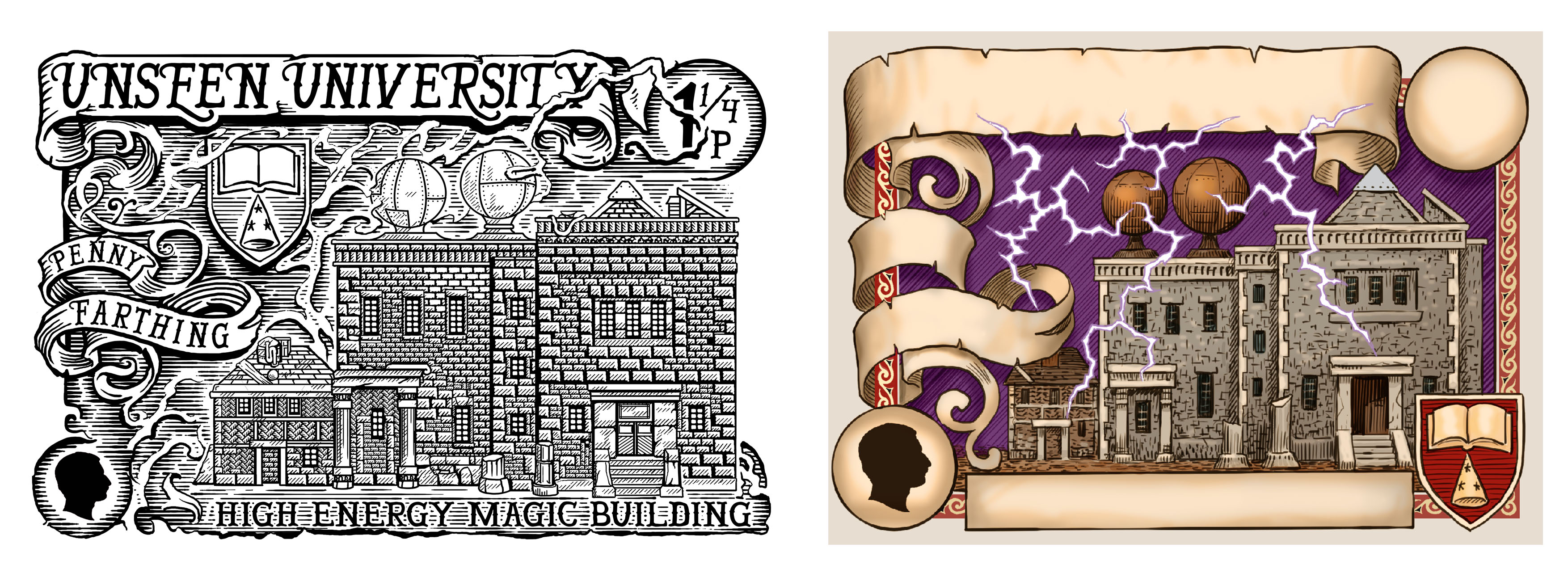
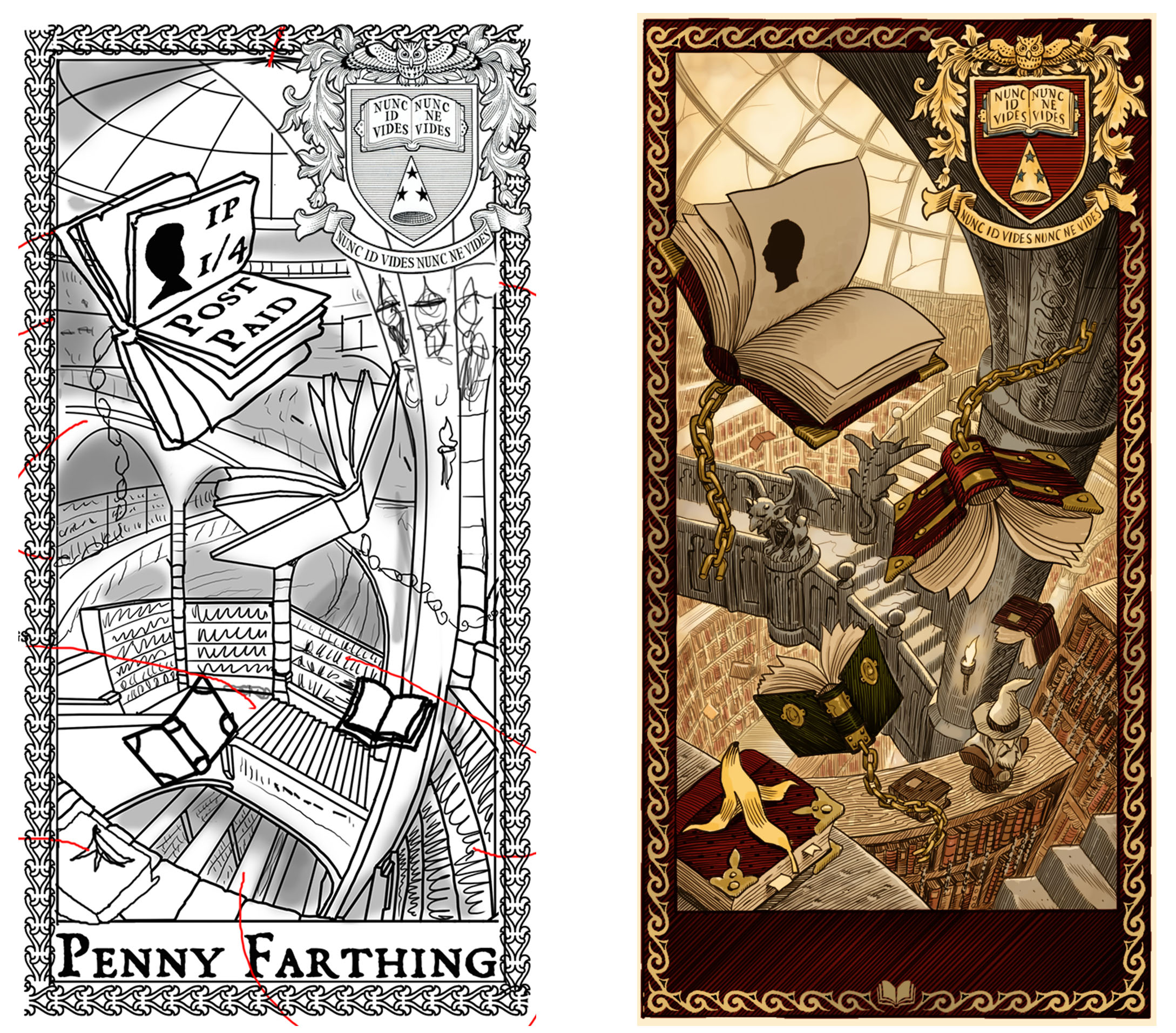
David was, again, bloody marvellous to work with. In this instance I was casting around for someone to suit the stamps I had in mind for the Unseen University set. Traditionally the UU stamps have been quite illustrative. More image than design. David was an obvious choice. His skill in creating a feeling of space and light in very small images was perfect for the centrepiece of the series, The Unseen University Library. I‘ve been wittering for a while, so for now I’ll just let you see what the talented Mr Wyatt made from my random scribbles and the resulting issued stamps; the Unseen University Penny and the Penny Farthing.
I could waffle on for hours about the way we choose a theme, build an image, work out a style, choose a colour schemes, select printing techniques, consider how they‘ll sit with the collection at large, incorporate sports, tell stories, get approval... but really I want to finish on why we use guest artists at all. Discworld Stamps are many things. There‘s no doubt they are a bit of a phenomenon and this is because, as poncey as it sounds, it is one of the most unique long-running illustrative projects I can think of, attached to perhaps the most detailed and rich fantasy world (n)ever to have existed. Each individual design has to stand alone and be a part of something much bigger. Discworld Stamps have never had a formula. The series is always changing. Some stamps take weeks, some mere hours. Some are led by design, others by ideas. But the truth of the matter is that to keep things fresh and exciting the project needs fresh and excited eyes from time to time. It needs input from people who think differently about the project. People whose skills are in areas we can only dream of. Horses for courses. We HOPE that as collectors you enjoy the change of pace from time to time. We hope you enjoy seeing who we choose to work with and see why we choose to do so. We know from your comments and feedback that, by and large, you enjoy the work. So we’ll be heading out into the wilds of the art world, with a big stick and modest carrot, doing our best to continue bringing home some of the extraordinary talent that exists from all over the globe.
Ian Mitchell, Esq.
Caveat: Do my ego a favour and keep in mind that this is the digital version of the 'back of a fag packet' stuff. It‘s always embarrassing to show your rough notes in public, the doodles I send to artists are 5 minute scribbles designed to be a way of discussing things... on their own they do look a bit like the nutty scrawlings of a disturbed 5 year old.
Articles
Here you will find articles mostly related to stamps, Discworld and elsewhere.
Wanted
We welcome articles from everyone, so if you feel you have something to say which will enlighted all the subscribers to the Journal please feel free to send it to the editor.
Don‘t be shy.

The Stanley Howler Journal is brought to you by the Discworld Emporium where you can find all your Flatalist needs.
August 22
January 21
Welcome the Year of the Beleaguered Badger
December 19
Year of the Condescending Carp
April 17
October 16
June 16
May 16
March 16
November 15
September 15
